Live Silverlight PivotViewer for Protein Structures Runs on Windows Azure
Update 8/1/2011: Changed date of first Excel DataScope CTP to Fall 2011.
The University of San Diego (UCSD) Supercomputer Center has made available a publicly accessible Silverlight PivotViewer Control running on the Windows Azure Platform at http://momcollection.cloudapp.net/. The PivotViewer performs filtering, sorting and Deep Zoom operations on a collection of 671 protein molecules from the RCSB Protein Data Bank maintained by the National Cancer Institute’s Pathway Interactive Database.
Eric Stollnitz and Joseph Joy introduced the Silverlight PivotViewer in their New Technologies for Immersive Content session at MIX10 on 4/14/2010. Microsoft Research’s new Excel DataScope project uses the PivotViewer for it’s UI (see section below).
Following is a summary of the RCSB Protein Data Bank’s archive:
The Protein Data Bank (PDB) archive currently contains the atomic coordinates, sequences, annotations, and experimental details of more than 70,000 proteins, nucleic acids and complex assemblies. Navigating and analyzing this large and rapidly expanding volume of structural information by sequence, structure, function and other criteria becomes increasingly difficult. The RCSB PDB website (http://www.pdb.org) provides powerful query, analysis and visualization tools to aid the user in mining the PDB. In addition, the RCSB PDB integrates structural data with information about taxonomy, biological function, protein domain structure, literature, Molecule of the Month articles and other resources, to present the data in a biological context. The three-dimensional (3D) structures make possible an atomic-level understanding of biological phenomena and diseases, and allow the design of new therapeutics.
The Molecule of the Month series is the source of the technical data about the molecules contained in the Silverlight PivotViewer Control’s *.cxml file. Images are stored in Deep Zoom format. You can learn more about the Silverlight PivotViewer Control in Chapter 12, PivotViewer of the team’s “Data & Networking” series.
Here’s a capture of the Azure control’s default view sorted by Macromolecule Type:
Clicking one of the tiles in the * DNA column opens a Deep-Zoom view of the simplified protein DNA structure with annotations from the Molecule of the Month article:
Steve Marx (@smarx) of the Windows Azure Team (@WindowsAzure) described Pivot, OData, and Windows Azure: Visual Netflix Browsing, upload a live demo with about 3,000 tiles to http://netflixpivot.cloudapp.net/ and provided downloadable source code for the C# project in his 6/19/2010 post.
Shortly after MIX10, Microsoft released an Excel add-in for the PivotViewer, described in the Silverlight Team’s 7/18/2011 Excel Tool page. Here’s a capture of the New Collection ribbon:
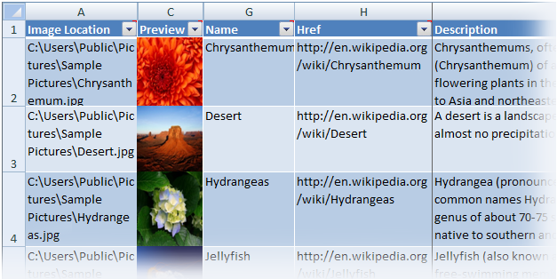
and a sample worksheet with added include names, links to Wikipedia articles, and Wikipedia descriptions:
Microsoft Research’s Excel DataScope Project
The Excel PivotViewer add-in is similar to that used by Microsoft Research’s first Excel DataScope CTP, which was announced became publicly available on 6/15/2011. Here’s the DataScope XDA File ribbon preparing to open a Workgroup stored in a Windows Azure blob:
A workspace contains both data and analytics and provides isolation for a group of data analysts to work together on shared data and data analysis models.
This ribbon appears after connecting to a Workgroup:
Once connected to a workspace the data analytics models and operators available in the cloud are displayed on the Excel DataScope Research Ribbon (these algorithms are implemented on Windows Azure).
Here’s the Dataset Import dialog connected to a blob in Azure storage:
Excel DataScope allows a user to sample from a data set in the cloud, which comes in handy when manipulating multiTB data sets in the cloud.
Here’s a geospatial cluster visualization with placeholders for image tiles not supplied:
An example of the data visualizations produced by DataScope after running K-means clustering on a cloud-scale data set of ocean sensor data. Each tile in the visualization is a data point in the collection. The visualization is interactive, users can ‘pivot’ on various attributes of the data and the collection is dynamically rendered.
Roger Barga advised me by email on 8/1/2011 that he expected first Excel DataScope CTP to be available in Fall 2011.


0 comments:
Post a Comment