Accessing the US Air Carrier Flight Delay DataSet on Windows Azure Marketplace DataMarket and “DataHub”
Contents:
Windows Azure Marketplace DataMarket
- Microsoft Codename “Data Hub”
- Building an OData URL Query and Displaying Data
- Using LINQPad to Execute URL Flexible Queries
- Exporting Data to Excel PowerPivot Tables and Charts
- Visualizing Flight Delay Data with Tableau Software
The initial five months (October 2011 through February 2012 of US Air Carrier Flight Delays data curated from the U.S. Federal Aviation Administration’s (FAA) On_Time_On_Time_Performance.csv (sic) files is publicly available free of charge in OData and *.csv formats from OakLeaf Systems’ Windows Azure Marketplace DataMarket and Codename “Data Hub” preview sites.
Accessing this dataset, which originates from an On_Line_Performance table in a SQL Azure server instance, for the first time isn’t an altogether intuitive process, so the following two sections describe how to open the dataset with the DataMarkets’ Data Explorer feature and execute queries against it with the Explorer’s Query Builder and the LINQPad application.
••• Updated 5/19/2012 by adding the Visualizing Flight Delay Data with Tableau Software section, illustrating a problem with the Explorer’s visualization feature and changing DataSets to DataSet, reflecting recent consolidation of monthly data into a single data offering.
•• Updated 5/16/2012 1:30 PM PDT by adding the Exporting Data to Excel PowerPivot Tables and Charts section.
• Updated 5/15/2012 12:45 PM PDT with sample C# expressions for a basic C# LINQ query executed in LINQ pad and customizing the query projection, as well as fixing a heading typo.
Windows Azure Marketplace DataMarket
1. Navigate to the DataMarket’s home page and, if you have a DataMarket Account, click the Data menu link:
2. On the Data page, click the US Air Carrier Flight Delays link:
2A. Sign in with your Windows Live ID. If you don’t have a Windows Azure Marketplace Datamarket account, complete the registration form:
Note: You don’t need to agree to Microsoft using your email address to continue with registration.
2B. Click Continue to open Microsoft’s terms of use, scroll to the bottom, and mark the I Accept the Terms of Use checkbox to enable the Register button:
2C. Click Register to create your account and open the US Air Carrier Flight Delays details page.
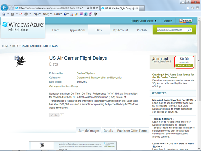
3. On the US Air Carrier Flight Delays details page click the Subscribe button:
Note: The subscription is free, so you don’t need to provide credit card details.
4. Mark the I Have Read and agree to the Above Publisher’s Offer Terms and Privacy Policy check box:
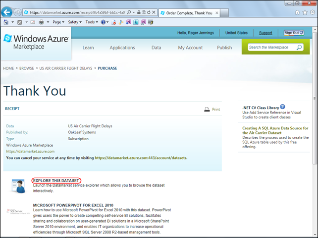
5. Click the Sign Up button to open the Thank You page:
6. Click the Explore This Data Set link to open the Build Your Query to Get Started form. See the Building an OData URL Query and Displaying Data section below.
Microsoft Codename “Data Hub”
1. Open the OakLeaf Systems “Data Hub” landing page at https://oakleaf.clouddatahub.net/:
2. Click the Transportation and Navigation menu link to open the page for OakLeaf datasets in that category:
Note: Presently there are two versions of the US Air Carrier Flight Delays dataset available; the second, which covers two months only, is obsolete. You can’t delete datasets in the first “Data Hub” preview version but users will be able to delete them in subsequent versions.
3. Click the US Air Carrier Flight Delays link to open its details page:
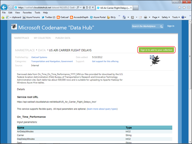
3A. Click the Sign in to Add to Your Collection button to open the Windows Live Sign In page. Type your Windows Live ID and Password in the text boxes and click Sign In to open the Registration page, if you aren’t already registered:
3B. Click Register to open the US Air Carrier Flight Delays details page.
4. Click the Add to Collection button to add the dataset to your datasets collection:
5. Click the Use link to open the same Build Your Query to Get Started page as the DataMarket version. Add query criteria and click Run Query to return the same dataset firstpage:
Building an OData URL Query and Displaying Data
1. Type discrete values to filter by in the appropriate text boxes:
Note: The preceding query returns the first 100 records for Southwest Airlines (WN) flights to Oakland Airport (OAK) during February 2012. If you omit all optional parameters you return the first 100 records in the order in which they were entered.
2. Click the Run Query button to return 100 rows and display the first about 20 rows in the default grid:
The OData URL query syntax is: https://api.datamarket.azure.com/Data.ashx/oakleaf/US_Air_Carrier_Flight_Delays_Incr/On_Time_Performance?$filter=Carrier%20eq%20%27WN%27%20and%20Dest%20eq%20%27OAK%27%20and%20Month%20eq%202%20and%20Year%20eq%202012&$top=100
Note: If the dataset had a transaction limit for free trials, each 100 rows you download represents a single transaction. Free OakLeaf datasets don’t have a trial transaction limit.
3. Click the right-arrow button (above the FlightData column header) to display the next set of rows. Alternatively, type a page number in the Go To text box and click Go to display those rows.
4. Click the XML button to display the rows in the Open Data (OData) format:

Using LINQPad to Execute URL Flexible Queries

1. Download and install LINQPad 4.42.1 or later for .NET Framework 4.0 or later from the LINQPad Web site.
2. Log in to the Data Market’s OakLeaf Systems dataset with the Windows Live ID you used for the above examples, proceed to the Build Your Query To Get Started page, select the Service Root URL value, https://api.datamarket.azure.com/oakleaf/US_Air_Carrier_Flight_Delays_Incr/, copy it to the clipboard and paste it to a Notepad instance.
3. Click the Primary Account Key label’s Show link to display the Account Key value. Select the value, copy it to the clipboard, and paste it to the same Notepad instance.
4. Optionally, execute the URI-encoded URL query and copy its contents to the Clipboard and then to the Notepad instance: https://api.datamarket.azure.com/Data.ashx/oakleaf/US_Air_Carrier_Flight_Delays_Incr/On_Time_Performance?$filter=Carrier%20eq%20%27WN%27%20and%20Dest%20eq%20%27OAK%27%20and%20Month%20eq%202%20and%20Year%20eq%202012&$top=100
Note: %20 = ASCII(0x20) = space and %27 = ASCII(0x27) = ' (single quote).
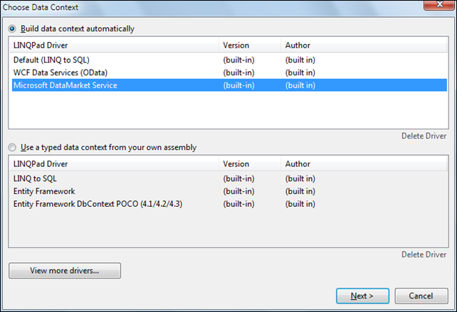
5. Launch LINQPad and click the Add Connection link to open the Choose Data Context dialog. Accept the default Build Data Context automatically option and select the Microsoft DataMarket Service item in the LINQPad Drivers list:
6. Click the Next button to open the DataMarket Connection dialog, copy the Service Root URL to the Clipboard and paste it to the DataMarket Service URI text box. Do the same with the Account Key value, add a friendly name (US Air Carrier Flight Delays) for the connection, and mark the Remember This Connection check box:
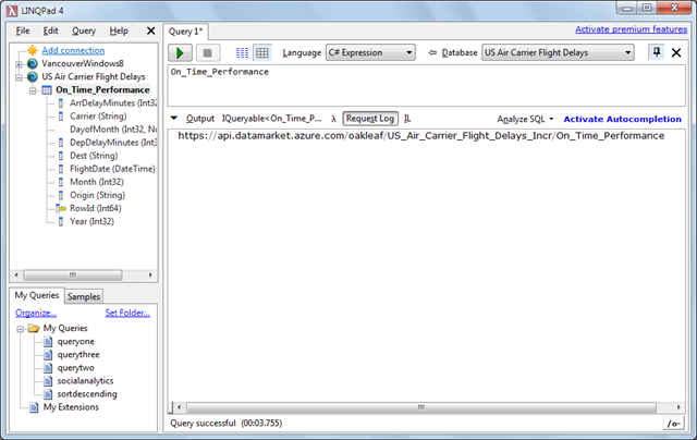
5. Click the Test button to verify the URI and Key, dismiss the Connection Successful message, click OK to add the connection, expand the connection node and its On_Time_Performance child node and drag the On_Time_Performance link into the Query 1 tab’s text box:
6. Click the button with the green arrow icon to execute the query and display the result in a grid:
7. Click the Request Log button to display the request syntax:
Note: The Request syntax is https://api.datamarket.azure.com/oakleaf/US_Air_Carrier_Flight_Delays_Incr/On_Time_Performance, but the preceding URL requires a user name and password.
Executing LINQ Queries with C# Expressions
• LINQPad lets you execute Language-Independent Query (LINQ) expressions, which the software translates to OData URL queries, in C# or VB. LINQ syntax is similar to SQL, but the order of the expression clauses differs by placing the from clause first and select clause last, as in:
from o in On_Time_Performance
where o.Carrier == "WN" && o.Month == 2 && o.Year == 2012
&& o.Dest == "OAK" && o.DepDelayMinutes >= 10
orderby o.DepDelayMinutes descending
select o
which returns a subset of the preceding rowset where the departure delay is equal to or greater than 10 minutes. LINQ queries offer much more versatile query capability than the Query Builder’s simple value based filters.
You can learn more about LINQ query syntax from articles linked to the MSDN Library’s LINQ Query Expressions (C# Programming Guide). My Professional ADO.NET 3.5 with LINQ and the Entity Framework book for Wiley/WROX has seven chapters about writing LINQ queries.
To execute the preceding expression and view the resulting OData URL query, do the following:
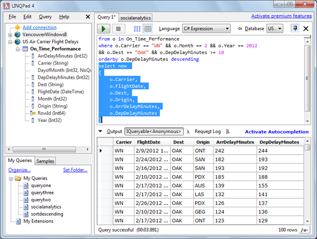
1. Copy and paste (or type) the LINQ query expression above into LINQPad’s query pane and click the execute button (with the green arrow) to display the first few rows in descending order of departure delay time:
2. Click the Request log button to display the first part of the URL query syntax:
The complete URL query is: https://api.datamarket.azure.com/oakleaf/US_Air_Carrier_Flight_Delays_Incr/On_Time_Performance()?$filter=((((Carrier eq 'WN') and (Month eq 2)) and (Year eq 2012)) and (Dest eq 'OAK')) and (DepDelayMinutes ge 10)&$orderby=DepDelayMinutes desc
Notice that the space (%20) and single-quote (%27) symbols are omitted in the URL query displayed. These are added by URI-encoding the query before sending it to the DataMarket.
Customizing the Projection with LINQ Queries
3. To customize the projection (i.e., columns displayed) by omitting Month, Year, and RowId columns and rearranging column order, replace select o with the following expression:
select new
{
o.Carrier,
o.FlightDate,
o.Dest,
o.Origin,
o.ArrDelayMinutes,
o.DepDelayMinutes
}
4. Execute the query to return the following data:
5. Click the Request Log button to display this URL query, which returns an IQueryable<Anonymous> type, by adding a $select clause:
https://api.datamarket.azure.com/oakleaf/US_Air_Carrier_Flight_Delays_Incr/On_Time_Performance()?$filter=((((Carrier eq 'WN') and (Month eq 2)) and (Year eq 2012)) and (Dest eq 'OAK')) and (DepDelayMinutes ge 10)&$orderby=DepDelayMinutes desc&$select=Carrier,FlightDate,Dest,Origin,ArrDelayMinutes,DepDelayMinutes
Note: LINQPad’s driver for OData connections doesn’t support SQL queries.
Exporting Data to Excel PowerPivot Tables and Charts
My two-year-old Enabling and Using the OData Protocol with SQL Azure of 3/26/2011 explained “how to enable the OData protocol for specific SQL Azure instances and databases, query OData sources, and display formatted Atom 1.0 data from the tables in Internet Explorer 8 and Excel 2010 PowerPivot tables.” The post also provided a “comparison of PowerPivot for Excel and Tableau (see the end of the “Working with OData Feeds in PowerPivot for Excel 2010” section.)”
My later Using the Microsoft Codename “Social Analytics” API with Excel PowerPivot and Visual Studio 2010 of 11/2/2011 explained how to open an empty PowerPivot worksheet and connect to a dataset provided by the Windows Azure Marketplace DataMarket.
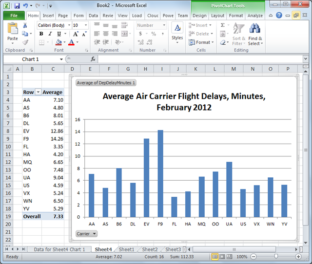
This example uses the Explorer’s Export to Excel 2010’s PowerPivot feature to create worksheet and chart of average departure delays by air carrier for a particular month. This procedure assumes that you have a MarketPlace account and a free subscription to the US Air Carrier Flight Delays dataset.
1. Download and install the x86 or x64 version of Excel PowerPivot from the download page to match the bitness of your Office 2010 installation.
2. Open the US Air Carrier Flight Delays dataset, sign into the DataMarket with an account that has a subscription to the dataset, click the Explore This Dataset link, specify 2 as the Month and 2012 as the Year for optional parameters, and click the Export button to open the Export pane:
Note: Specifying a single month and year limits the spreadsheet to about 500,000 rows.
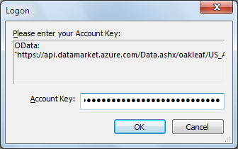
3. Accept the Excel PowerPivot option and click the Lower Download button and click Open when asked if you want to open or save the ServiceQuery.atomsvc file from datamarket.azure.com to open Excel’s Table Import Wizard dialog. Replace the default Friendly Connection Name with US Air Carrier Flight Delays for this example, copy your Account Key from Notepad and paste it into the Account Key Text box, and mark the Save My Account key:
Note: If you don’t have the Account Key copy in Notepad, click the Find button to open the Account Keys page, select your Account Key, and then copy and paste it to the text box.
4. Click Next to open the Wizard’s Select Tables and Views dialog:
Note: If you receive the following message:
the Account Key you entered probably is the problem. Click the Find button (see step 3) to open the Account page, copy the Account Key, and paste it to the Account Key text box.
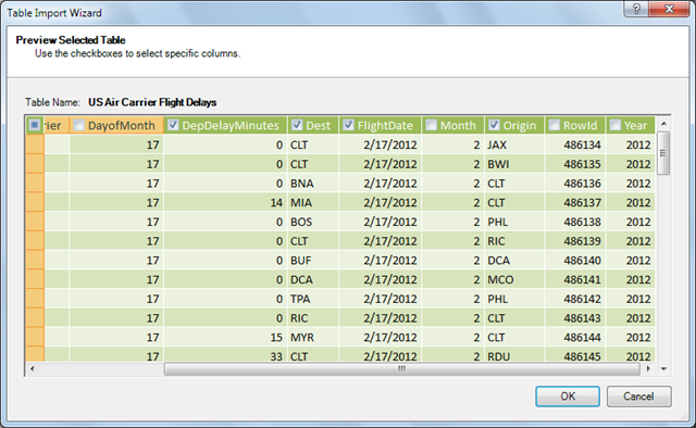
5. Click the Preview & Filter button to display the Preview Selected Table dialog. Clear the DayofMonth, Month, RowId and Year check boxes to omit the columns from the PowerPivot worksheet:
6. Click OK to close the dialog and click Finish to begin downloading data. The Status column displays the number of rows downloaded:
7. After all rows download, click Close to dismiss the Wizard and view the data in a worksheet:
8. Open the PivotTable gallery and select Pivot table to open a new sheet with a PowerPivot Field List pane. Mark the Carrier and DepDelayMinutes check boxes to add Row Labels for Carriers and default Sum of DepDelayMinutes values:
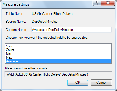
9. Click the arrow in the Values text box’s Sum of DepDelay… item, select Edit Measure to open the Measure Settings dialog and select Average as the aggregation function:
10. Click OK to close the dialog and display the average values:
11. Click the PivotTable button again, select Pivot Chart and specify this worksheet:
12. Click the Field List to hide the pane, change column C’s heading to Average, change the cell format of Column C to Number, expand the chart by dragging the corners, edit the title as shown below, and select and delete the Total legend:
Visualizing Flight Delay Data with Tableau Software
Tableau Software (@Tableau) publishes data visualization software with an emphasis on big data. According to the Tableau blurb on OakLeaf’s US Air Carrier Flight Delays offering on the Windows Azure Marketplace DataMarket:
Tableau provides drag-and-drop data visualization based on best practices and patented technology from Stanford University. Tableau allows you to publish dashboards to the web with one click. It’s rapid-fire business intelligence that anyone can use.
According to the publisher:
Tableau Public is a free service that lets you create and share data visualizations on the web. Thousands use it to share data on websites and blogs and through social media like Facebook and Twitter. Tableau Public allows you to see data efficiently and powerfully without any programming.
Easy drag & drop interface:
- No programming language
- No plug-ins
- No Flash, so it shows up on the iPad …
How it works:
Tableau Public visualizations and data are always public. Anyone can interact with your visualizations, see your data, download it, and create their own visualizations from it.
When you save your visualizations, it will be to the publically accessible Tableau Public web servers -- nothing is saved locally on your computer. You can then embed your visualization on your blog or website or share it through social media or email.
Tableau Public can connect to several data sources, including Microsoft Excel, Microsoft Access, and multiple text file formats. It has a limit of 100,000 rows of data allowed in any single file and there is a 50 megabyte limit on storage space for data. [Emphasis added.]
Warning: As noted in the preceding quotation, Tableau Public works with a maximum of 100,000 data rows, which you won’t discover until you attempt to use a query that returns more than that amount of data.
The DataMarket provides a terse Using Marketpalce [sic] Datasets with Tableau Public tutorial with no screen captures of successful visualizations. The following procedure doesn’t suffer from that omission:
1. Download Tableau Public 7.0 from its download page. The download requires entering your email address.
Tip: The Thank You for Downloading … page appears immediately, but you must wait for a few minutes for the Do You Want to Run or Save TableauDesktop.msi … ? message to appear before taking additional actions.
2. Click Run to install the software, accept the license agreement, and click Install. Watch the Getting Started video, if you want. Close the Book 1 page.
3. Open the US Air Carrier Flight Delays dataset, sign into the DataMarket with an account that has a subscription to the dataset, click the Explore This Dataset link, and specify LAX as the optional parameter, which returns 86,940 rows with the current dataset. Click the Export button to open the Export pane, and mark the Tableau option in the Export to Program section:
4. Click the lower Download button and click Open when presented with the following message:
5. Click the Show button (see step 3’s screen capture) to display your Primary Account Key, copy it to the Clipboard and paste it in Tableau Public’s Login dialog:
6. Click OK to download the data and open Tableau Public’s main page and drag the Carrier dimension to the top Drop Field Here region, as shown here:
7. Select the DepDelayMinutes measure and drag it to the Rows shelf; select the Carrier dimension and drag it to the Columns shelf to enable appropriate chart styles in the Show Me gallery.
8. Open the Rows menu, select Measure (Sum) and choose Average in the submenu:
9. Here’s the basic column chart from the preceding steps.
You can edit and format the chart and axis titles, but due to the limited number of rows accommodated, further work probably isn’t warranted.
I have recommended that the DataMarket team add notice of the limitation in the number of rows supported by Tableau Public to their documentation.





















0 comments:
Post a Comment